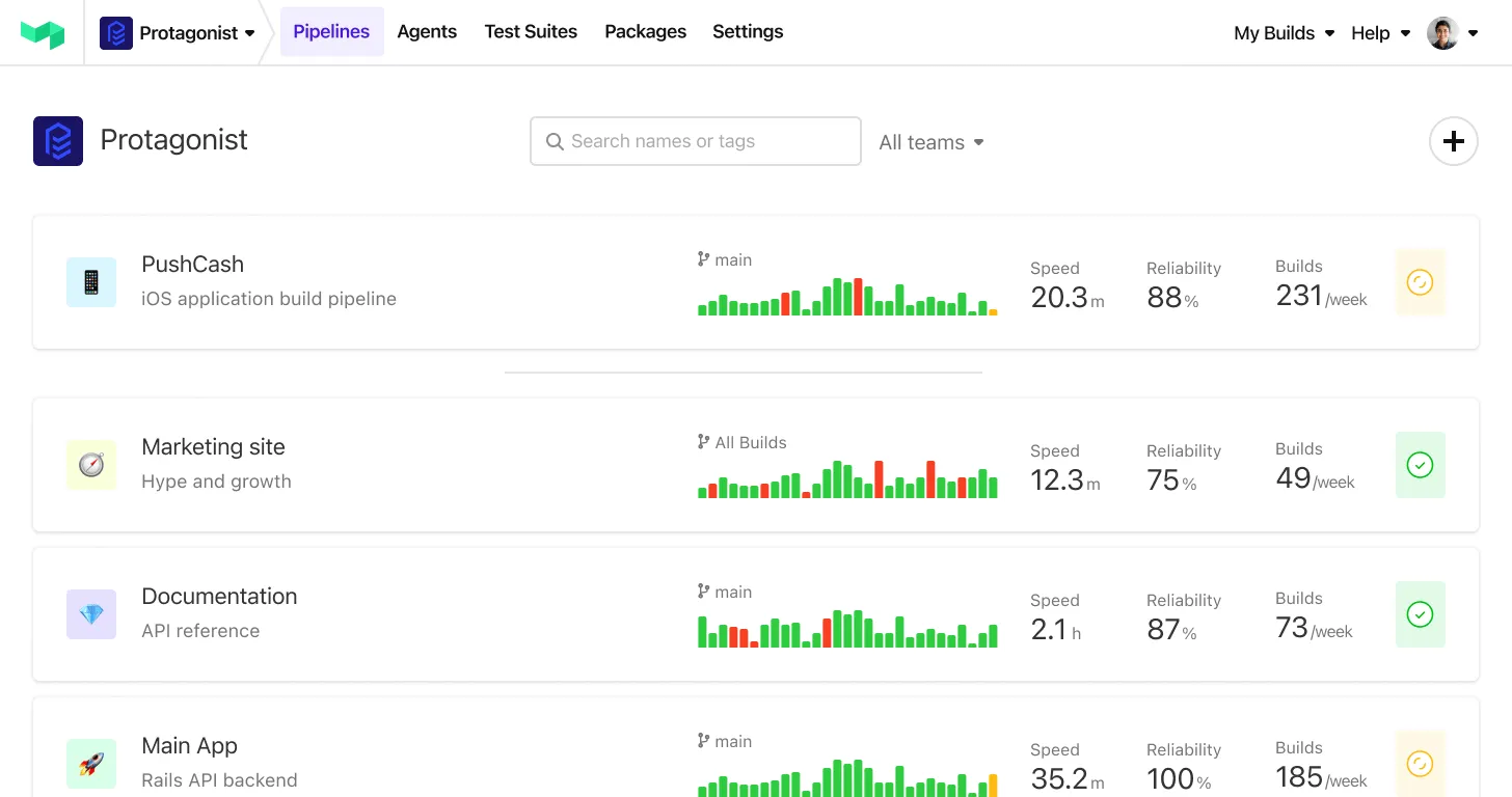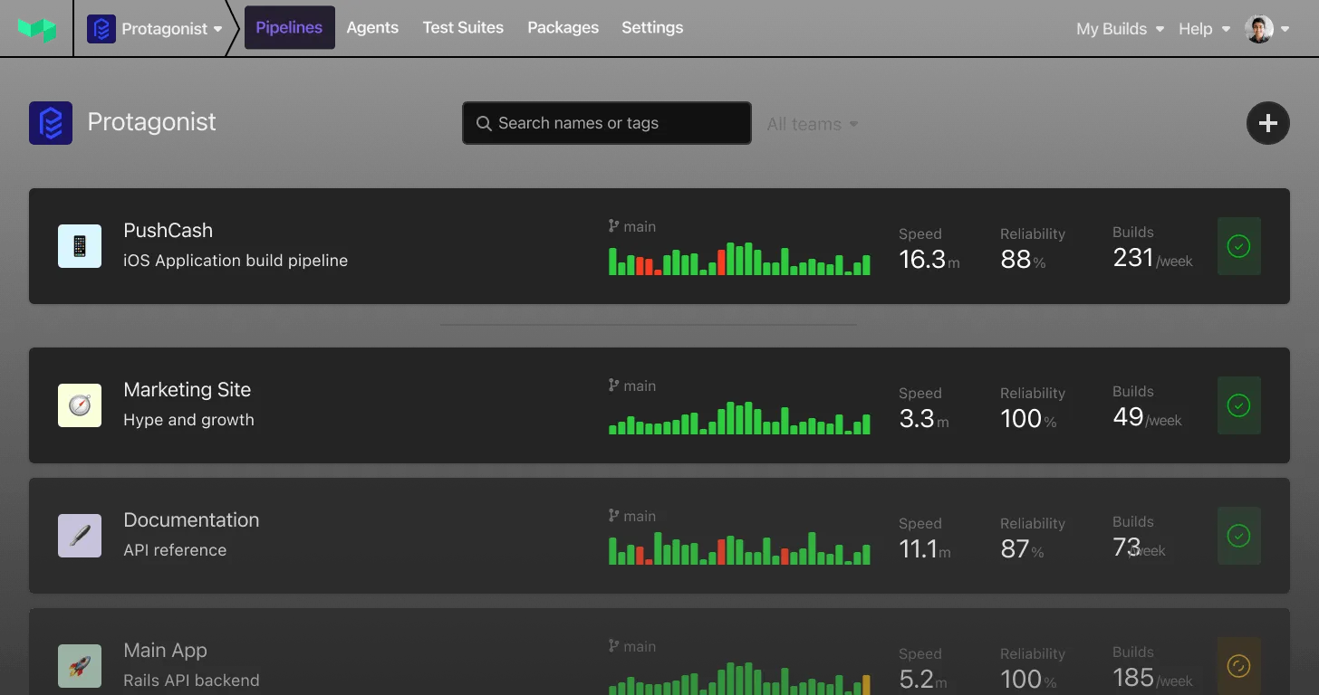
Great product design requires a deep understanding of a system’s underlying design principles. Those principles often exist only in the heads of other people, leaving designers with only the design feedback process to figure out what they are.
As Buildkite grows, close collaboration among our product management, engineering and product design teams is essential for consistency of features and improvements. As designers, we need to facilitate how this collaboration will happen.
A great way to accelerate product design is to put your product design principles down on paper. They’re like your company’s values — but for product design.
The end product is not just for product designers; these principles can give everyone at the company a language for giving design feedback, and become a sort of extension to your company’s values.
I recently created the first version of our own product design principles at Buildkite. Read on to see what each principle is, how we came up with it, and resources for creating your own.
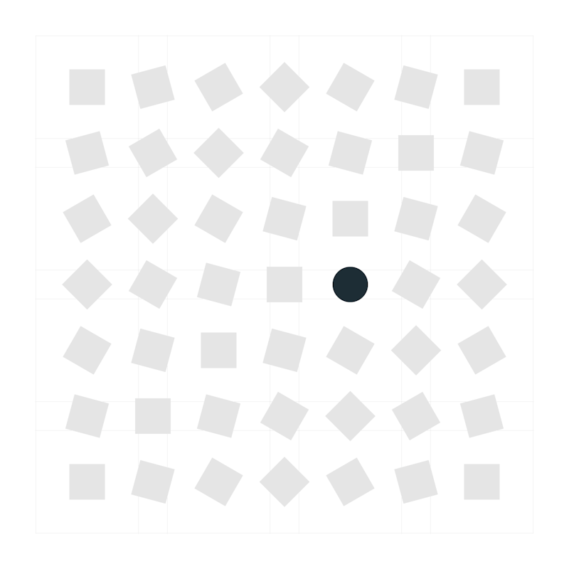
Help customers identify problems
Principle 1: 🔍 Help customers identify problems
Buildkite’s tools provide visibility into the cause of problems, and steps for getting back on track.
Applying this principle:
- Does this feature show what’s wrong in a meaningful way?
- Is this feature providing enough reliable visibility into the underlying activity?
- Where is the threshold when lots of things are going wrong? How do we keep from overwhelming people?
How was this created?
While working on Test Analytics, one customer told us “Nobody cares about ‘green’ builds.”. This had us thinking. After some digging into exactly what they meant, we discovered our biggest strength and opportunity is to help people navigate failure states — things that cause daily pain and confusion, that teams can’t often find time to debug and to put in a proper fix.

Provide a pro tool, with a self-managed learning curve
Principle 2: 🧰 Provide a pro tool, with a self-managed learning curve
Many of our customers customize Buildkite extensively to suit their needs. When we think about design in this aspect, we want to make sure teams have a good foundation to enable them to get started. When they want to customize, we show them how to do it with extensive documentation and helpful, non-intrusive cues in the interface.
Applying this principle:
- Are we providing enough cues to help someone to figure out how this feature works?
How was this created?
As designers and software engineers, the more we think about the narrative of how our customers use our products, the more likely we can understand the context and their motivations, crafting a more complete picture of the problem we are trying to solve.
A great example is our documentation, which is an important part of a product’s design. Documentation not only needs to describe what the interface is trying to do. But it can also point out when we’ve designed a poor workflow when it can’t be described effectively.
Let them pop the hood
Principle 3: 🚗 Let them pop the hood
The interface should be intuitive, so that from a visual perspective, it gives you everything you need at a glance. But if you need to poke around and look a bit further and get things customized, you can certainly find your way.
Applying this principle:
- Does this feature enable full access to the underlying complexity when needed?
- How does someone discover the cue to extra features/complexity when they need it?
How was this principle created?
Buildkite comes with many features, templates, and guardrails to help new teams get up and running. When teams are ready to customize and move beyond those defaults, Buildkite stays out of the way and gives people full access to the power and abilities.
Be trustworthy, friendly and honest
Principle 4: 👋 Be trustworthy, friendly and honest
We want to sound professional, but we're also a company that is empathetic. We care about the people who use our products and understand that teams that use Buildkite depend on it for the success of their product or business.
Applying this principle:
- Are we striking the right balance between professional and friendly?
- How does our interface respond when something goes wrong?
- How does our interface encourage trust?
How was this principle created?
Let’s take how we relay a problem to a customer as an example. While working on Test Analytics, we had to design how our new notifications would work. We don't want to overwhelm them with too many messages. We have to find the balance between a really important alert versus something in the background that could be saved for later. By informing users about the most important thing they should be focusing on, we can help instil trust in our interface.
Future iterations
Having principles is a great start, but what about anti-principles? What are some of the things that would never fit into our customers’ priorities, or that we would not consider part of our principles? In defining what is not a principle, we set our constraints and focus on the best possible outcome.
Create your own
Getting started is easy, and doesn’t have to take a lot of time. If you’re looking to incorporate principles in your product design team, I recommend:
- What makes a good set of principles?, asks Julie Zhuo
- Product principles can be also defined by practice, like R&D, Engineering and Product Design
- What do you value in your interface? Defining interface values helps teams stay focused when there are trade-offs to be made
- Looking for more examples? Here’s an entire collection of design principles used by other teams
This first draft of our product design principles has helped elevate our understanding, and create new types of discussions. We’re on a mission to unblock every developer on the planet, and using these four principles as guidelines helps us keep that top of mind.
What do you think?
I highly encourage you to give them a go yourself, and let us know about it on Twitter. Or if you’ve found similar practices that have helped you scale product design, we’d love to hear about them too.
p.s. Interesting in joining the team? We’re currently hiring for a lead product designer, senior product designer (docs), and a visual designer (web). Check out our careers page to learn more and apply.


